Calligraphy, the art of beautiful writing, was once used to create important documents. With the advancement of technology and the emergence of numerous computer fonts, this art has become less relevant. Nevertheless, calligraphy can be invaluable for writing letters, cards, and invitations, as well as in various creative projects.
Basics of Calligraphy
Step 1. Learn the Basic Principles of Calligraphy.
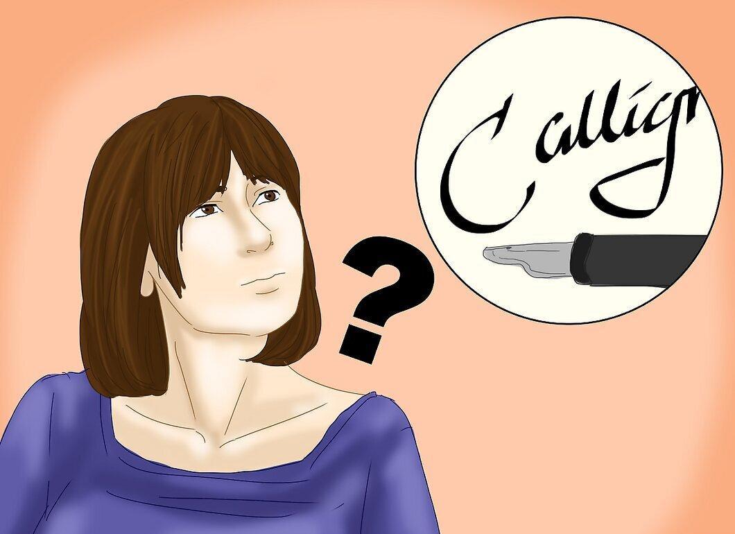
Master the fundamentals of calligraphy. Here, letters are created through the alternation of thick and thin lines. They are written differently than we are used to. The contrast of lines gives the letters a unique appearance. Here are a few basic rules:
- The angle of the pen should remain constant.
- Do not apply excessive pressure while writing.
- All lines should remain parallel, even when writing ovals.
Step 2. Acquire a Variety of Pens.
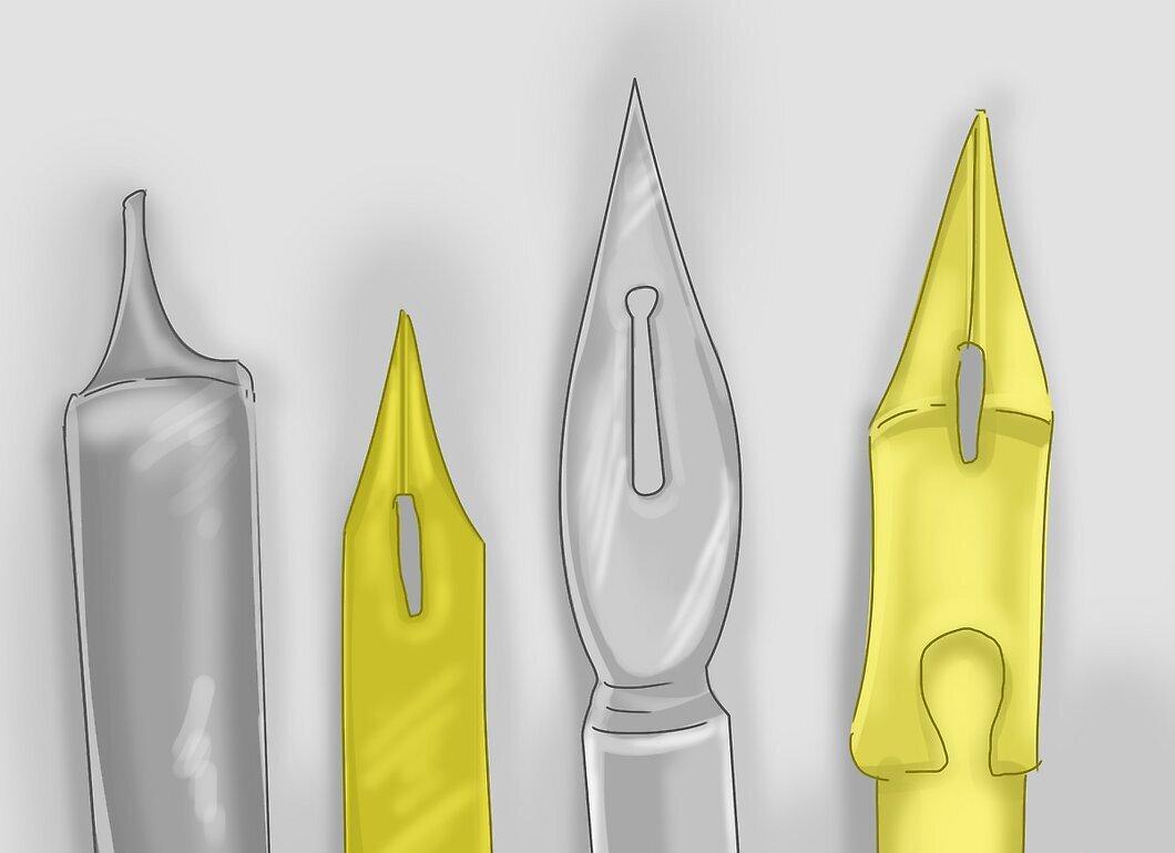
Choose several different pens. A calligraphy pen differs from regular pens in that it has a flat, broad tip. This allows for contrast between thick and thin lines, making calligraphic letters more elegant. Pens come in different sizes, so it’s worth trying a few.
Step 3. Hold the Pen at a Fixed Angle.
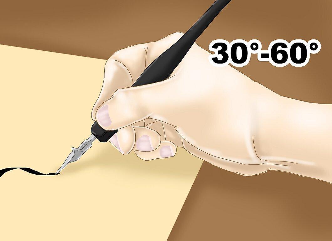
Make sure the pen is always held at the same angle. It should be tilted to the left at an angle between 30° and 60°. Different fonts may have their own tilt angle, depending on how you hold the tool.
Step 4. Aim for Consistency of Shapes.
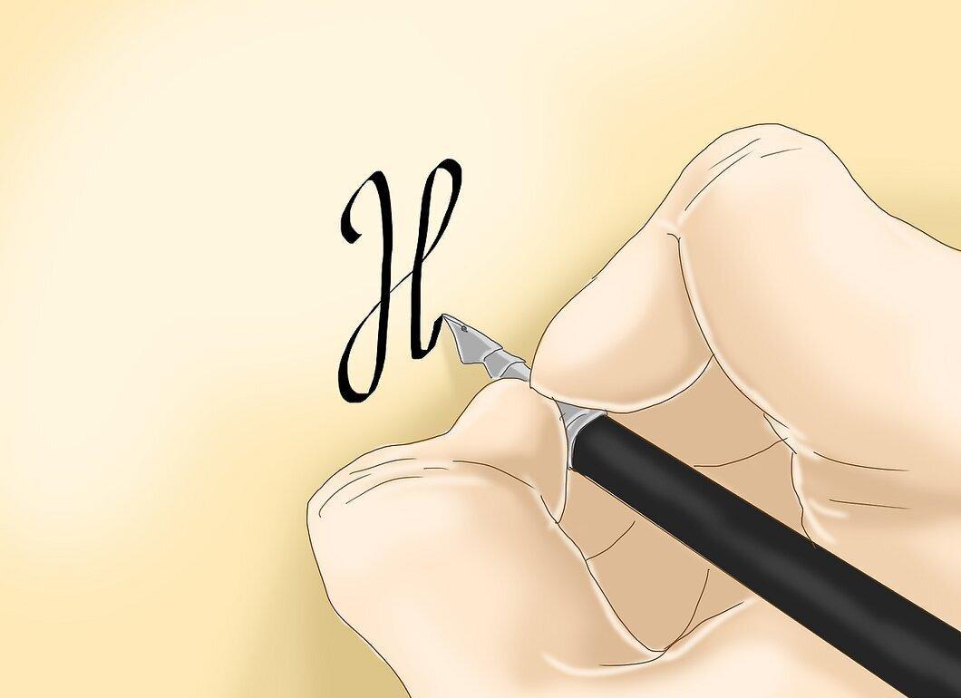
Ensure uniformity in the shapes of all elements. The pen should not rotate while writing. For the letters to look correct, the pen must always point in one direction. Sometimes this means lifting the pen off the paper to add missing strokes. All elements should be constructed according to the same rules, making the letters more cohesive.
Step 5. Do Not Apply Too Much Pressure on the Pen.
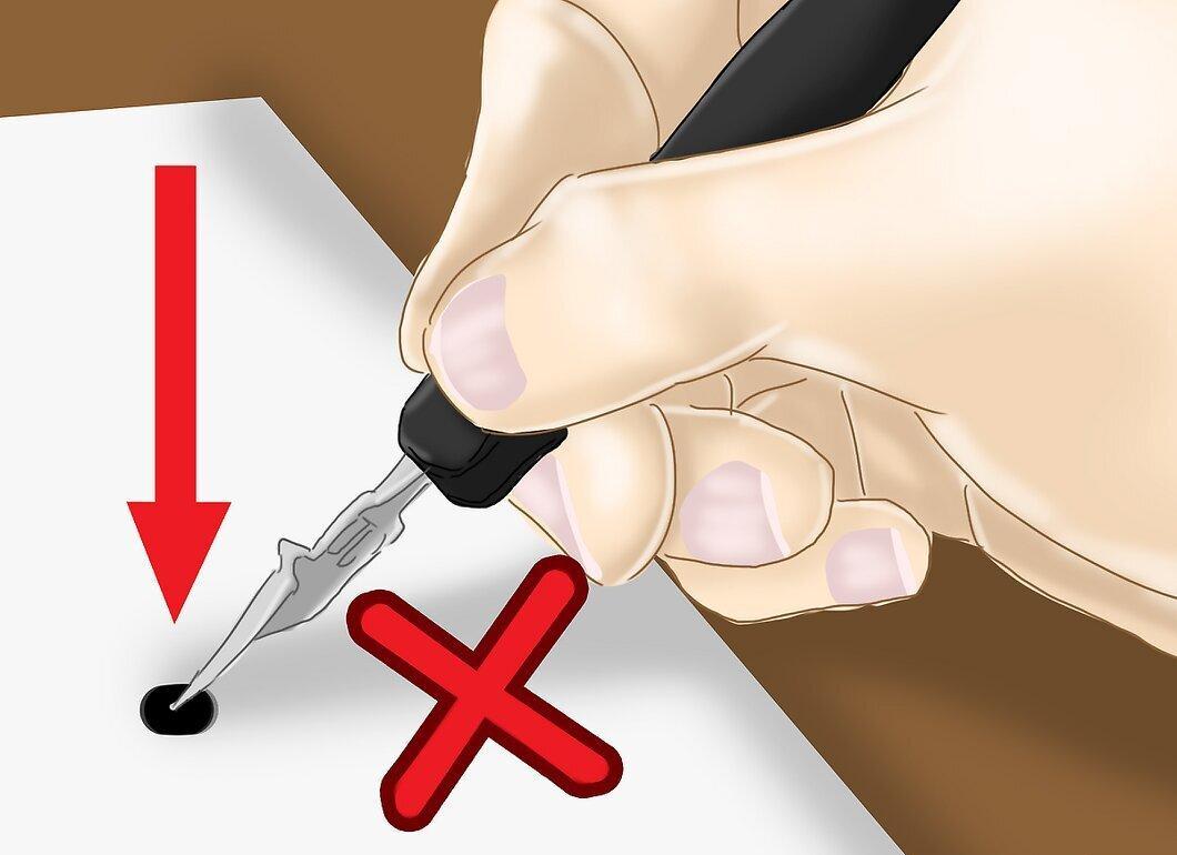
Do not press down too hard on the pen. Each stroke should be smooth and light. The pen can be moved in different directions, but it’s important that your palm, wrist, forearm, and elbow do not touch the table. This will help you make lighter movements.
- Excessive pressure can lead to breaking the pen and incorrect letter shapes, as well as quick hand fatigue.
- Incorrect pressure can damage the paper and cause ink to bleed. So follow the basic rules of calligraphy.
Step 6. Watch for Line Parallelism.
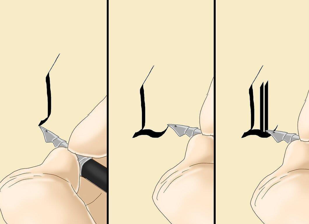
Pay attention to the parallelism of vertical, horizontal, and diagonal lines. This rule applies to any font. For instance, in calligraphic italic, the lines are slanted, while in Gothic, they are strictly vertical.
Step 7. Maintain a Consistent Tilt for Letters.
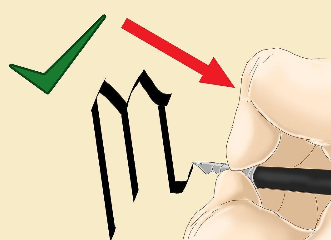
It is important that all letters have the same tilt angle. This is as crucial as holding the pen correctly. Even if the tilt of the letters is correct, if the pen is held incorrectly, it will reflect in their appearance. Do not change the tilt angle of the pen while writing different strokes.
- To ensure the letters look uniform, you may need to lift the pen from the paper and not turn it while doing so.
How to Create Letters in Gothic Style
Step 1. Try Writing in Gothic Style.
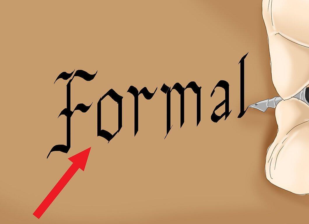
Start by writing letters in Gothic style. This style is characterized by broad, square letter forms. All letters are created using the same vertical strokes. The Gothic font can add atmosphere to book covers, posters, and even movie credits. It is also used for diplomas and certificates.
Step 2. Pay Attention to the Unity of Forms.
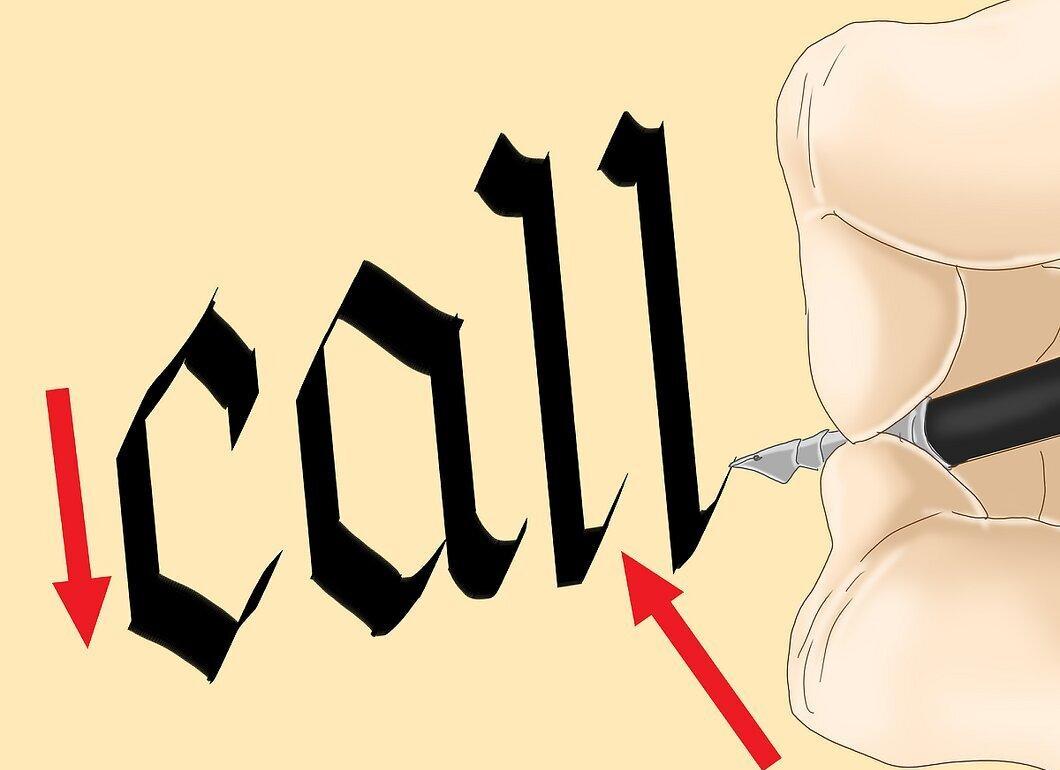
Ensure that all letters look the same. The Gothic font is quite dense, and the letters appear broad and angular. Similarity in forms creates uniform text. Some rules apply in this style:
- Hold the pen at an angle of 30° to 45°.
- Lines are drawn only vertically.
- Use diagonal lines from top to bottom for decorative elements.
- Write letters with short, clear movements.
- Ensure the elements are unified.
Step 3. Hold the Pen at a 30° Angle.
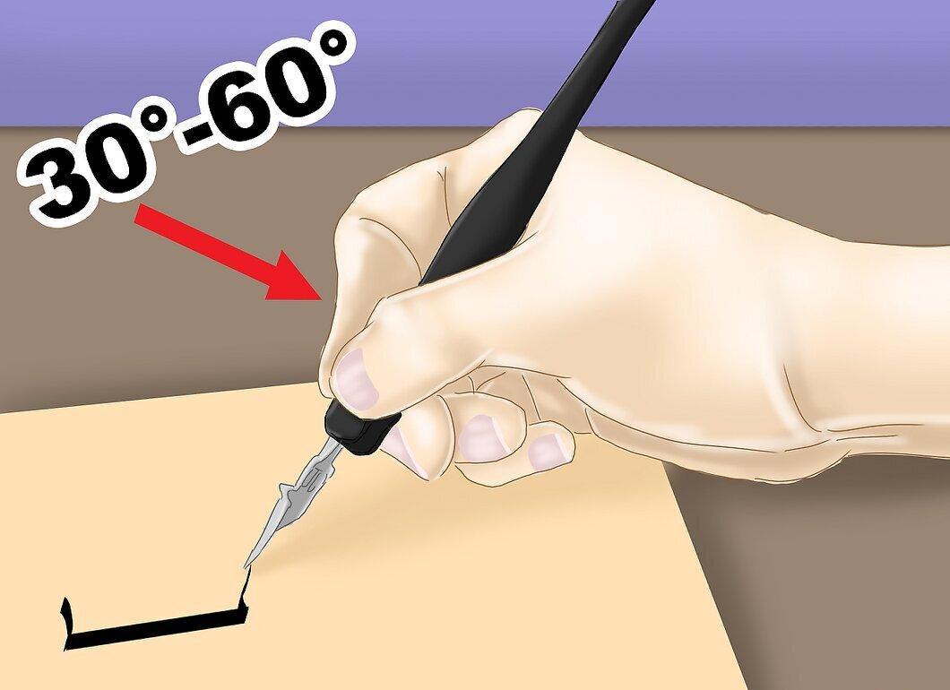
Keep the pen at a 30° angle. While this angle may vary slightly, try to maintain it consistently for uniform letters.
Step 4. Write Each Letter with Several Strokes.
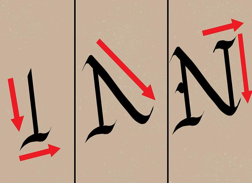
Try to write each letter not in one motion but using 2-4 strokes. Each letter has many similar elements.
Step 5. Start with a Straight Line.
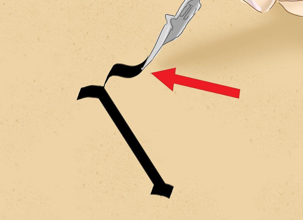
For the letters h, m, n, r, and t, the first stroke will be the same. Hold the pen at a 30° angle and draw a straight line down, then add a tail at a 45° angle. The tail should be short and sharp, not overlapping with other letter elements.
Step 6. Add a Curved Line.
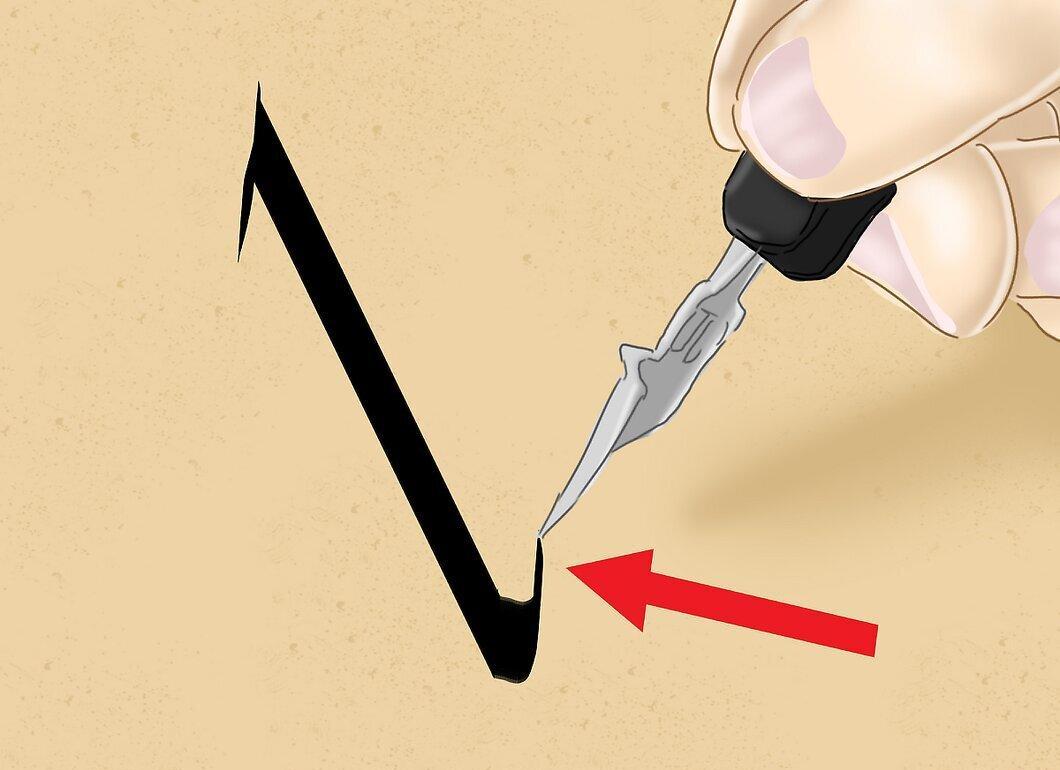
For the letters b, d, l, u, and y, start with a straight line down and add a tail to the right at a 45° angle. The line should be smooth rather than sharp.
Step 7. Write Oval Elements.
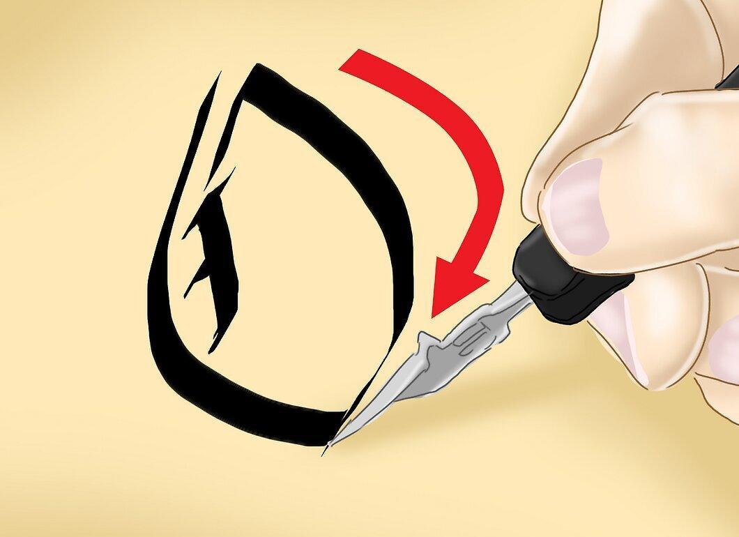
To create an oval for the letters b, c, d, e, o, p, g, and q, start at the top, then shift right and down to draw the top of the ovals. After that, lift the pen from the paper and draw another line down and to the left to connect the two lines.
Step 8. Watch for the Tilt.
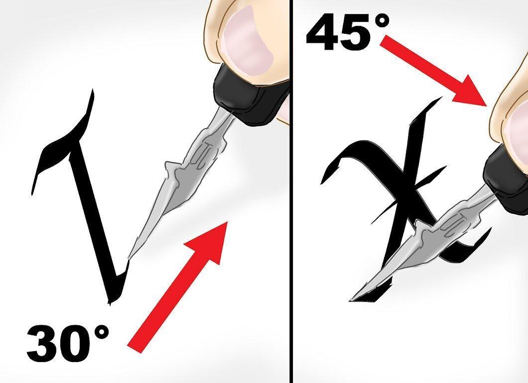
Some elements require a 30° tilt, but when writing the letters k, v, w, and x, the tilt should be 45°. First, draw a line from the top down, then shift right or left at a 45° angle. When you reach the bottom point, change the angle to 30° to create a curve.
Step 9. Write the Letter "a" in Three Movements.
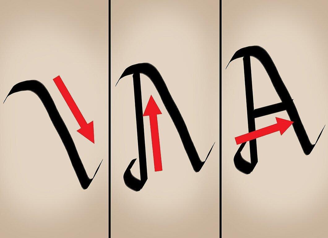
The letter "a" is written in three movements. Hold the pen at a 45° angle, start with the tail by drawing a line right and up, then down and to the right. Finish with a tail directed up and to the right. After that, lift your hand from the paper and create the bottom of the oval by drawing a line from left to right and down. Complete the top of the oval by connecting it to the start of the second stroke.
Step 10. Write the Letter "s" in Three Strokes.
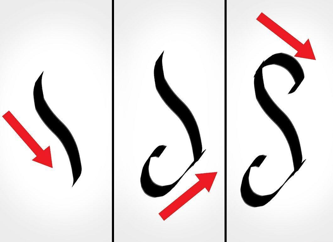
For the letter "s", draw the central line down from left to right. Then add the bottom line from left to right, connecting it to the center. Finally, draw the top line from left to right, starting from the central line and going down.
Step 11. Create the Letter "z" with Horizontal Lines.
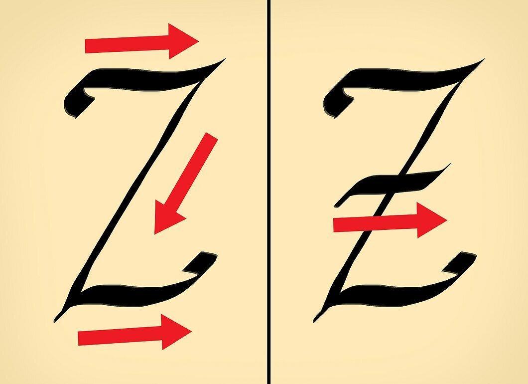
To form the letter "z", the pen needs to move left and right, creating horizontal lines. To make the letter "z" look curved, slightly bend the lines at the start and end. Ensure the tilt angle of the pen remains the same. Draw the central line from the right corner down at a 45° angle, then add a second horizontal line starting from the end of the central line and going right, remembering to include the bends.
Step 12. Pay Attention to Repeating Elements.
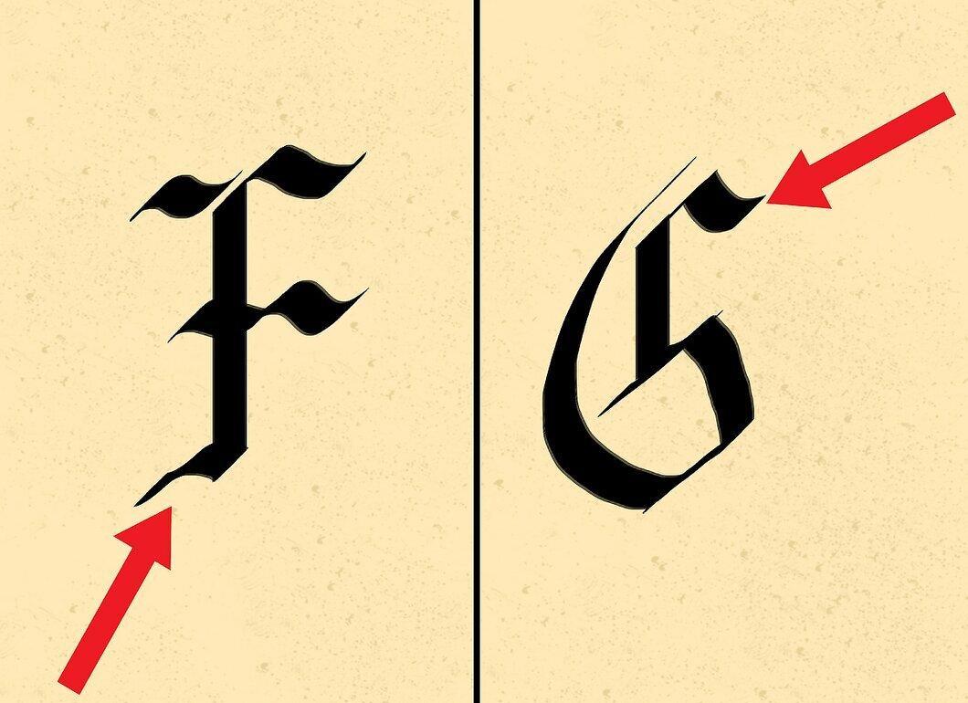
Despite the differences in writing the letters "g" and "f", the main line with the tail is the same for both. Draw down with the pen and create a tail to the left. Do not lift the line up; instead, lift the pen and draw another line down and to the left to connect them.
Step 13. Learn to Write the Entire Alphabet.
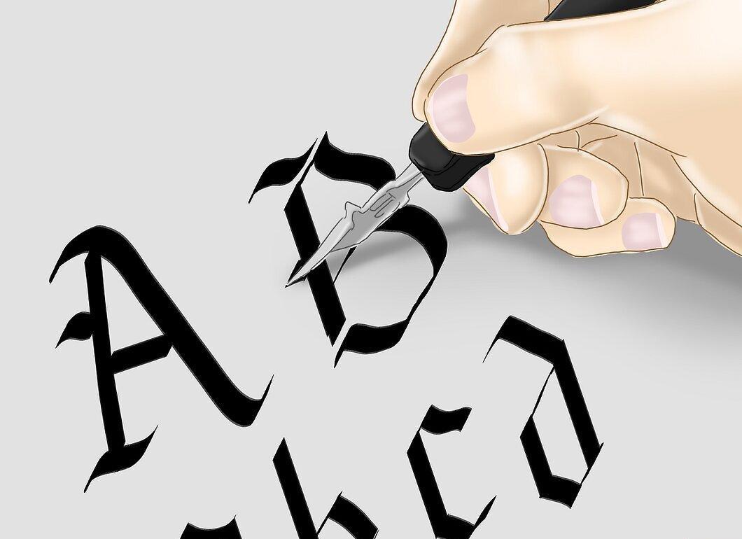
All letters can be created by following these rules. Spend time practicing writing the entire alphabet to achieve uniformity.
How to Write in Italics
Step 1. Master Italic Letters.
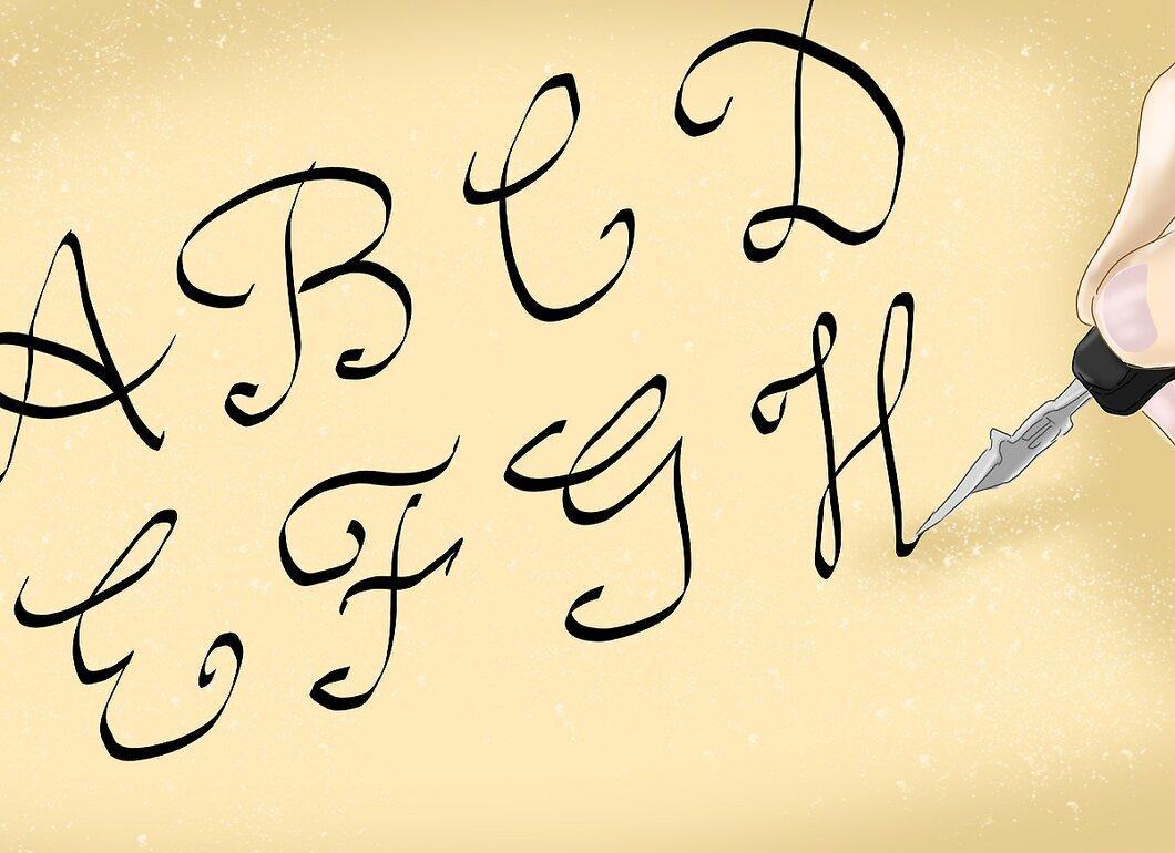
Calligraphic italic is very similar to regular script. Most letters are written in one motion, as the goal of italics is to speed up the writing process. You will need skills in writing descending, ascending, and oval strokes.
Step 2. Learn the Basic Strokes.
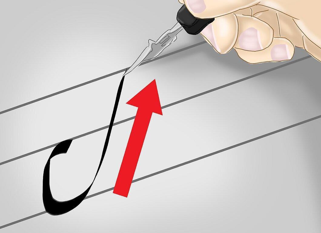
Take ruled paper and start a little above the bottom line. Write a small tail down to the bottom line, then draw a line up from left to right.
Step 3. Practice Writing the Descending Stroke.
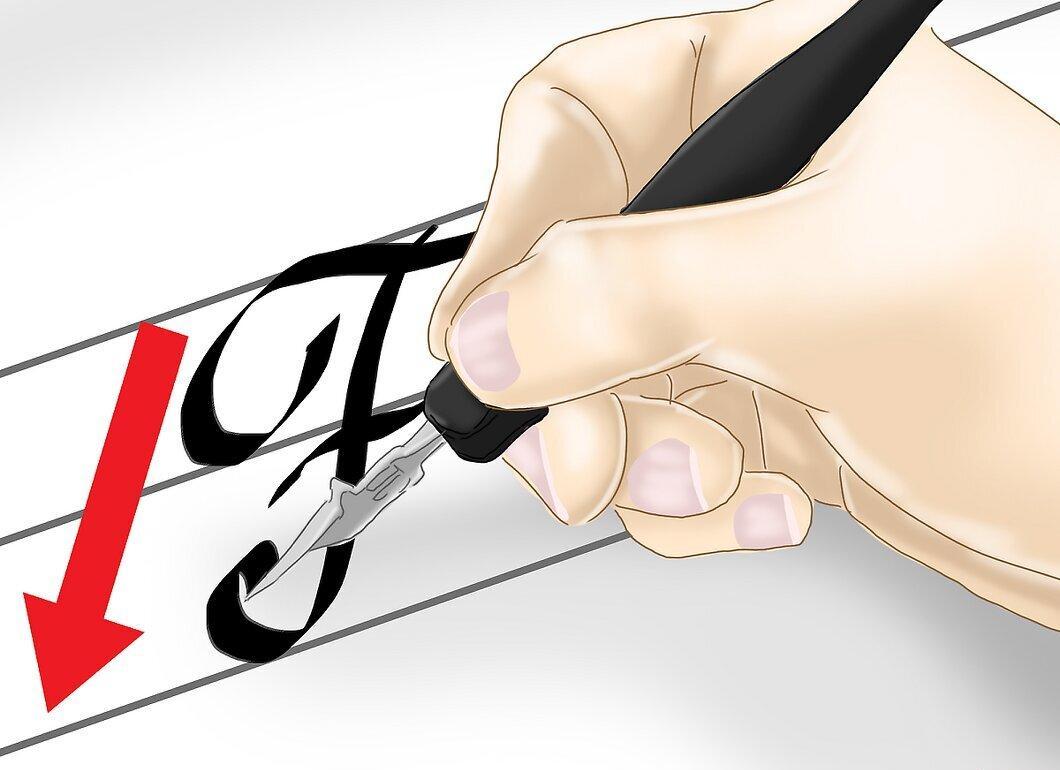
The letters b, f, h, i, j, k, l, m, n, p, r, s, t, u, v, w, x, y, and z begin with a downward stroke. In some letters, this stroke reaches the top line, while in others, it reaches the middle. The letter "f" can extend below the bottom line. The descending stroke is written from right to left.
Step 4. Practice Drawing an Oval, as in the Letter "o".

Place the pen below the top line. Shift to the right and draw a line to the top point. Then draw the oval moving down and to the right.
Step 5. Write the Letter "u".
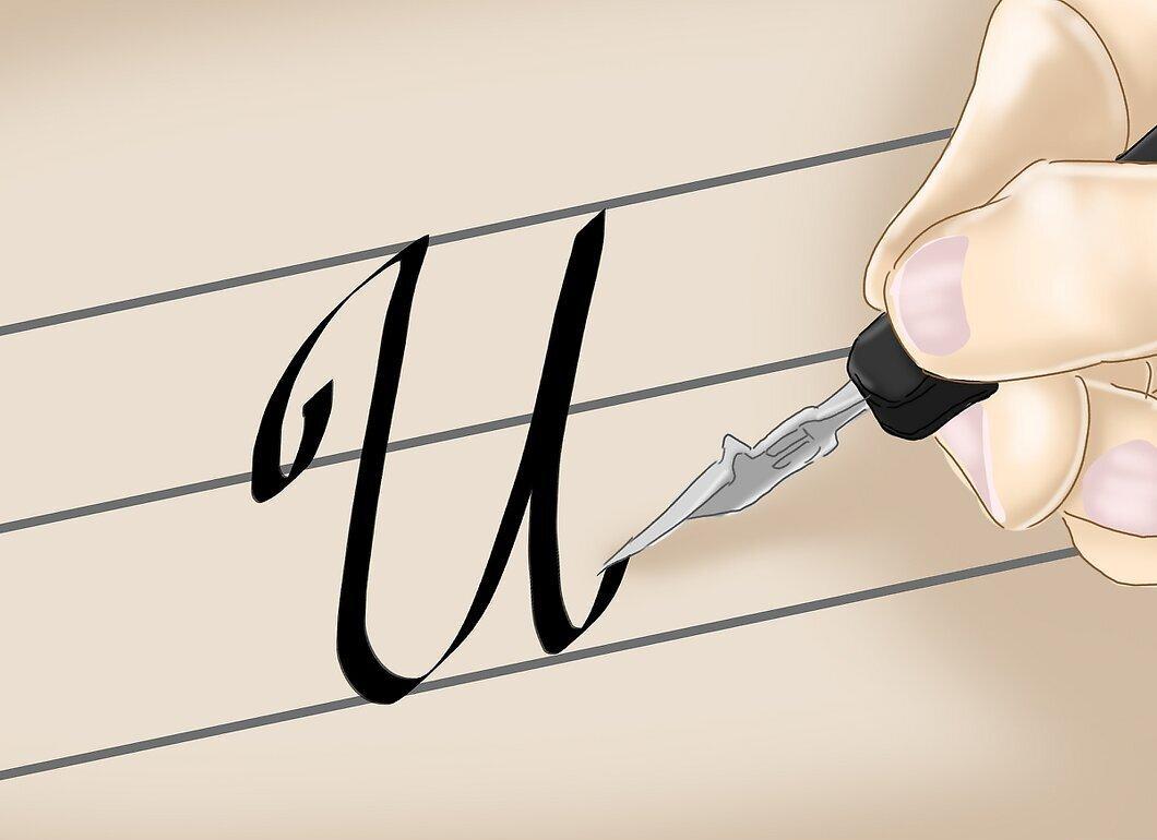
Place the pen on the bottom line. Draw the main line up, then down with a tail up. Return to the start of the letter and draw a line down, curving it so that both lines connect.
- This stroke is found in the letters i, j, m, n, r, v, w, and y.
Step 6. Write the Letter "h".
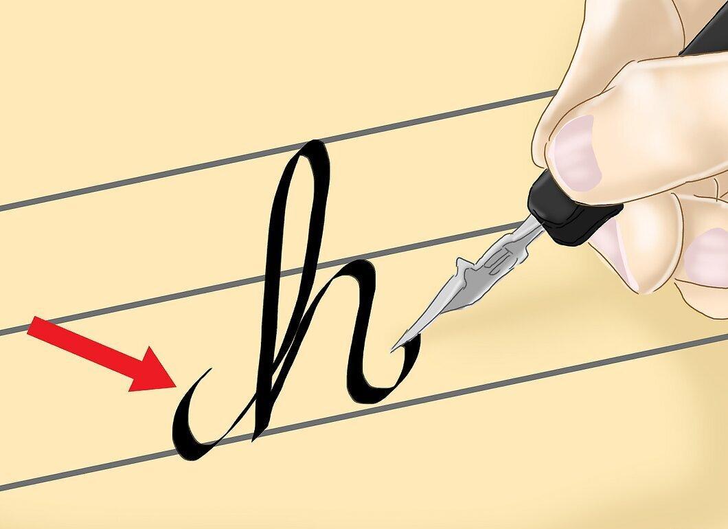
Start from the bottom line and raise the line up to the top. Then curve the line to the left and draw a stroke down to the bottom line, so they intersect. Raise the line to the middle and add another stroke down, finishing with a tail.
- The letters b, f, k, and l are written similarly.
Step 7. Try Writing Other Letters.
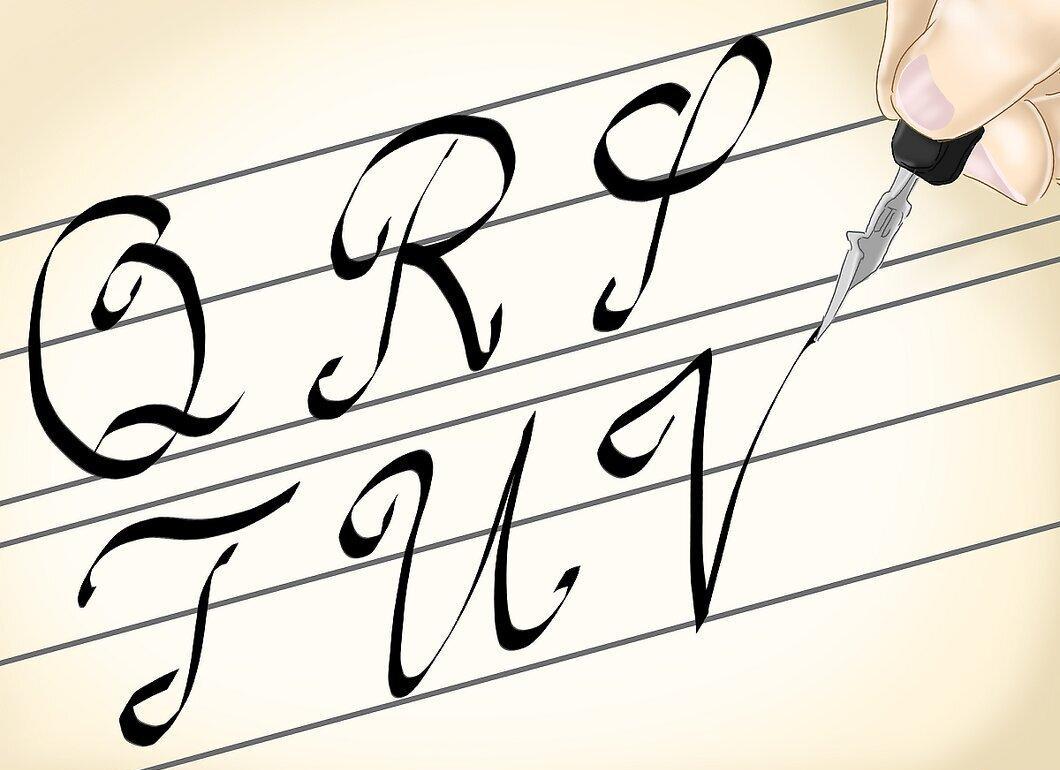
Use the italic alphabet to better understand how the letters should look. Remember to watch the tilt angle and avoid uniform movements.
How to Choose Paper for Calligraphy
Step 1. Use Special Coated Paper.
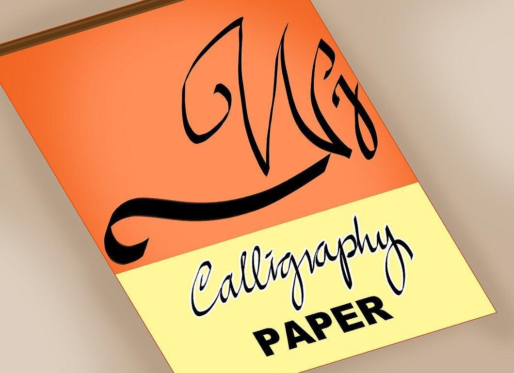
Coated paper reduces ink absorption, preventing bleeding. This is the most popular choice for calligraphy, as it allows for clear letters.
Step 2. Choose Neutral pH Paper.
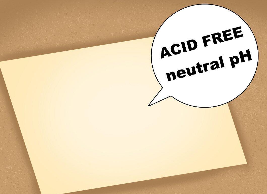
To ensure the paper doesn't yellow or crumble over time, choose neutral pH paper. It is treated in a special way, allowing it to last longer.
Step 3. Try Archival Paper.
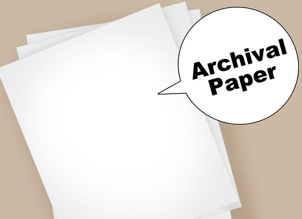
Archival paper is made from cotton or linen and is treated with alkalinity, so it doesn't yellow over time. Look for paper or notebooks labeled "neutral pH" or "archival."
How to Write Letters Without a Pen
Step 1. Sketch Lines with a Pencil.
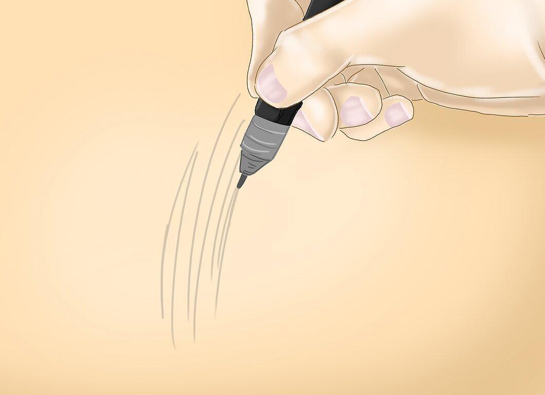
Start with a pencil sketch. This will help correct mistakes. Pencil can be easily erased, and you can draw over it with a corrected line.
Step 2. Use a Ruler for Straight Lines.
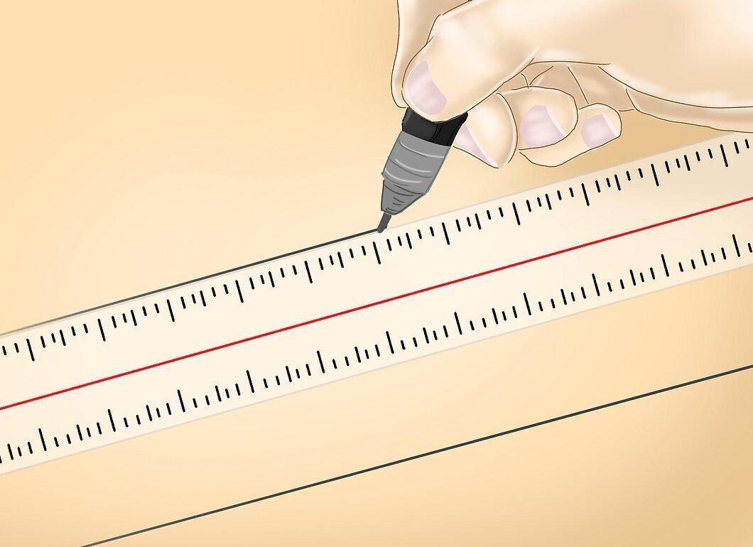
Draw straight lines with a ruler. They should be parallel to the top and side edges of the paper.
- To prevent the paper or its surface from shifting, secure it. This will help you achieve straight letters.
Step 3. Choose a Font to Copy on Your Computer.
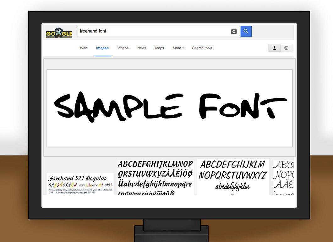
Find the font you want to copy on your computer. You can use fonts in a text editor or find them online. Look for the desired font and keep it in view.
Step 4. Start Drawing Letters.
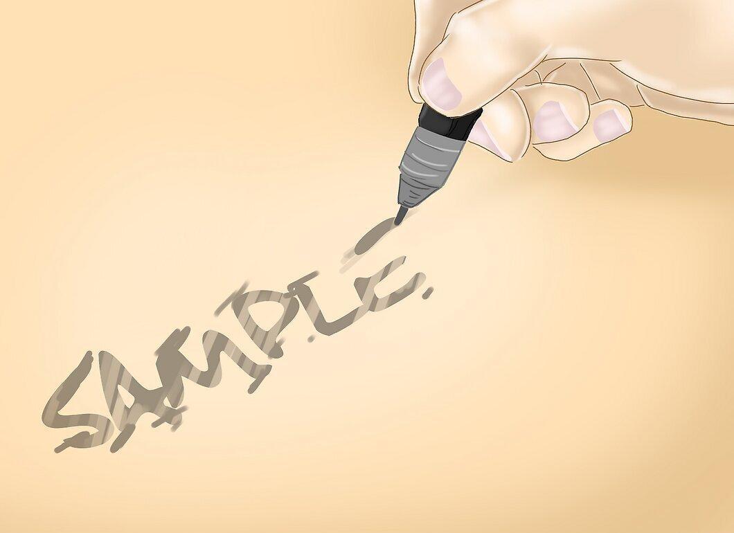
Take your time, and try to be neat. Use a ruler if necessary.
Step 5. Trace Over Pencil Lines with a Special Pen.
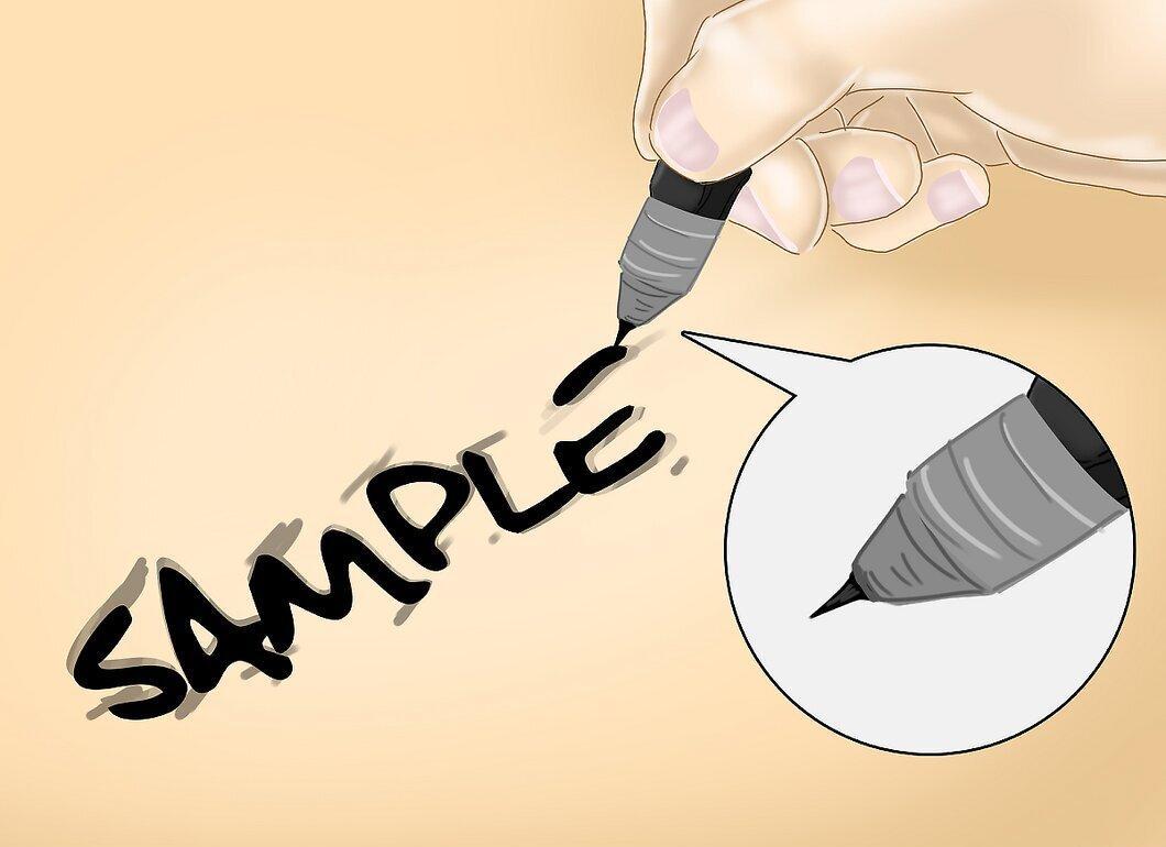
Use a pen with a fine tip to trace over the pencil lines. Choose a pen that glides smoothly on the paper to achieve clear lines. Such pens can be ordered online.
Step 6. Erase the Guidelines.
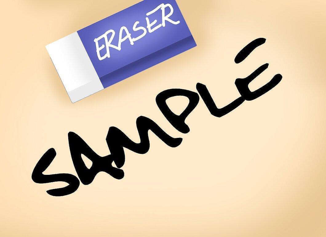
Be careful not to smudge the ink. Erase the lines only after the ink has completely dried.
How to Use a Stencil for Writing Letters
Step 1. Purchase a Stencil for Italic Font.
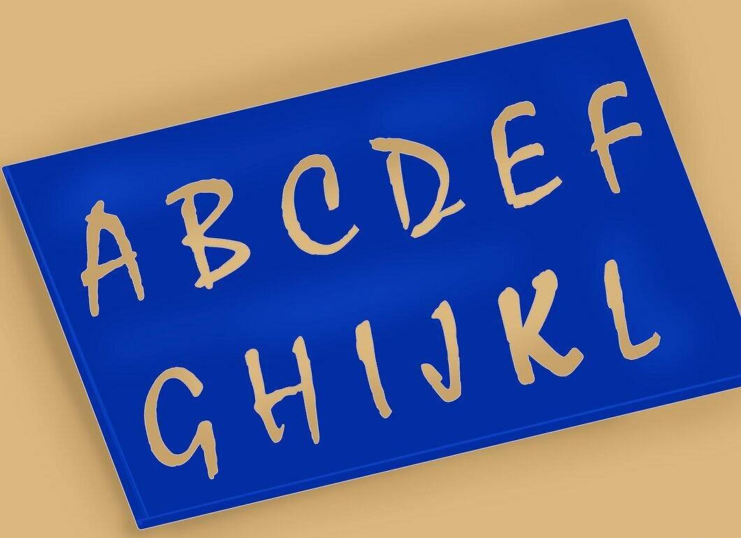
Buy a stencil for italic font. It will help you achieve even letters. There are many stencils available for different italics.
Step 2. Sketch Letters with a Pencil.
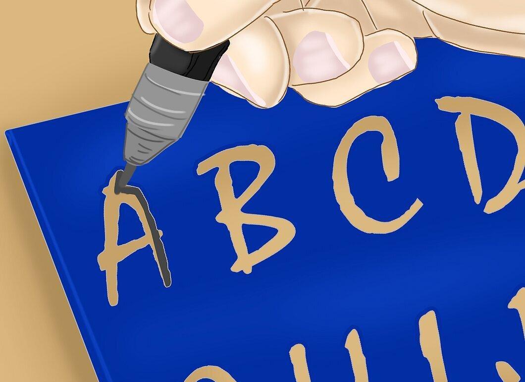
First, make a sketch. This will simplify correcting errors in the letters and spacing between them. Use a quality calligraphy pencil that glides well on paper.
Step 3. Add Decorative Elements.
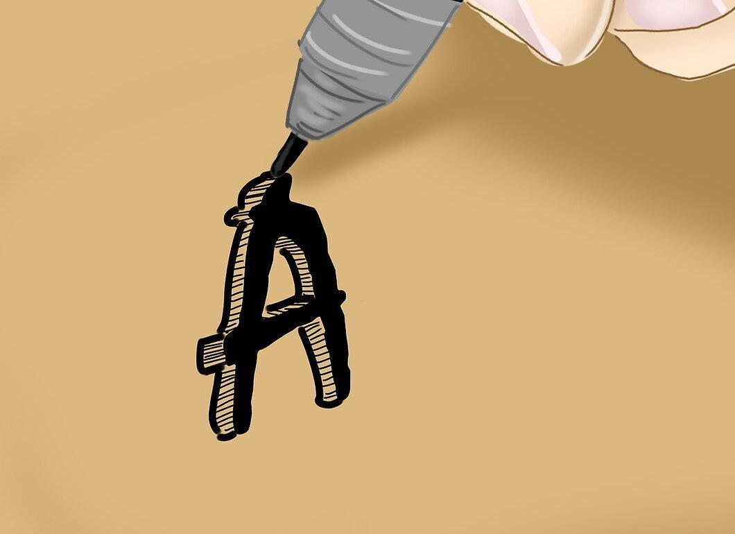
After finishing the sketch, add additional elements such as dots, swirling lines, colored accents, and more. Decide for yourself what the final result will look like.